
Published on 5/12/2026
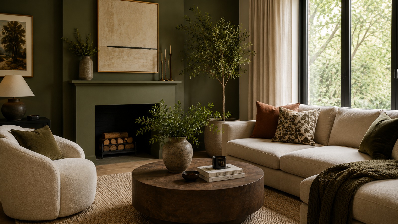
Tired of bland grays and stark whites? Designers are moving away from safe neutrals and embracing richer, more expressive palettes. In fact, platforms like TheHouse48 increasingly showcase homes that already reflect these bold, modern interior choices, where color is used to add depth, warmth, and personality rather than just decoration.
The Return of Deep Jewel Tones
Jewel tones are being used across full rooms, not just accents, to create richness and atmosphere.
Emerald & Forest Green
These shades bring a natural calm and grounded elegance. They work well on walls, cabinetry, or statement furniture.
Moody Teal & Peacock Blue
Dramatic yet balanced, these tones add depth and sophistication without feeling overpowering.
Aubergine & Plum
When paired with brass or gold accents, these purples create a luxurious, layered finish ideal for feature spaces.
Earthy & Muted Warm Tones
Warm, grounded colors are replacing cooler minimalism, making interiors feel more human and lived-in.
Dusty Rose & Faded Coral

Soft alternatives to beige, they introduce subtle warmth and work especially well in relaxed, Mediterranean-inspired spaces.
Burnt Sienna & Deep Rust
Best expressed through textured materials like leather, ceramics, or stone, these tones add organic richness.
Clay in Kitchens

Clay-toned cabinetry is becoming a standout choice, offering warmth and a more natural alternative to standard white kitchens.
High-Contrast Color Pops
Used sparingly, bold accents create energy and visual focus within neutral spaces.
Safety Yellow & Chartreuse
Small touches like décor or lighting are enough to add vibrancy without overwhelming the room.
Cobalt Blue
A strong statement color often used in furniture or tiles to create instant focal points.
Soft Alternatives to Black & White
Design is shifting toward softer contrasts. Charcoal replaces harsh black, while warm creams replace stark white for a more livable, layered feel.
Why These Colors Are Trending
This shift reflects a broader desire for comfort, emotion, and sustainability in interiors. Warmer palettes feel more personal and help counter the flatness of digital life, while also aligning with more natural, lasting design choices.
As seen across curated spaces on TheHouse48, these tones are becoming central to how modern homes are styled less about perfection, more about personality.
Final Thoughts
Interior design in 2026 is about expression over rules. Deep tones, earthy shades, and bold accents all help create spaces that feel intentional and alive.
Sign up for our emails and be the first to know about special offers.
Sign In
Comments